← GalleryDownload source code
- Category
- Components
- Tier
- Free
- Prompt
- 493 words
- Includes
- Prompt + source code
Components
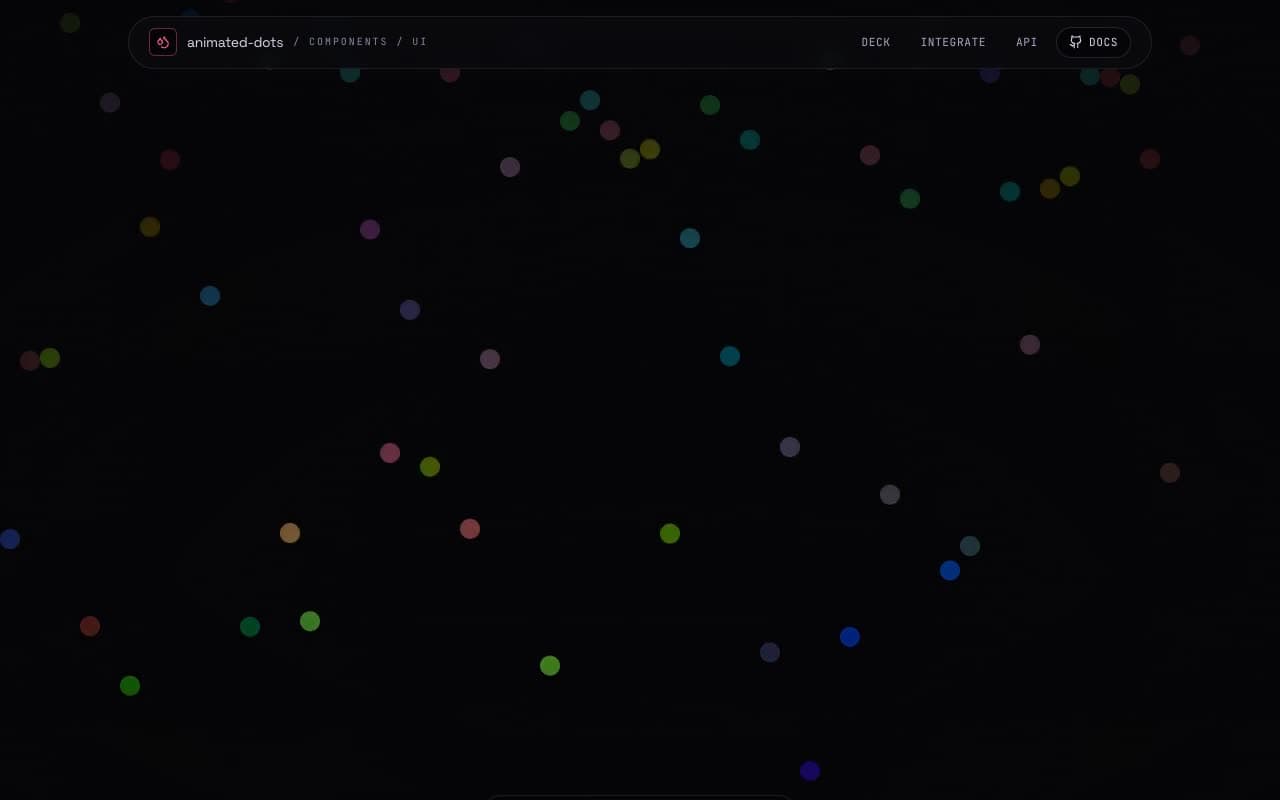
Luminous Dot Field — Gradient Backdrop
framer-motionreacttailwindtypescriptvite
The prompt
YOU ARE GIVEN A TASK TO INTEGRATE AN EXISTING REACT COMPONENT IN THE CODEBASE

THE CODEBASE SHOULD SUPPORT:

- SHADCN PROJECT STRUCTURE
- TAILWIND CSS
- TYPESCRIPT

IF IT DOESN'T, PROVIDE INSTRUCTIONS ON HOW TO SETUP PROJECT VIA SHADCN CLI, INSTALL TAILWIND OR TYPESCRIPT.

DETERMINE THE DEFAULT PATH FOR COMPONENTS AND STYLES.
IF DEFAULT PATH FOR COMPONENTS IS NOT /COMPONENTS/UI, PROVIDE INSTRUCTIONS ON WHY IT'S IMPORTANT TO CREATE THIS FOLDER
COPY-PASTE THIS COMPONENT TO /COMPONENTS/UI FOLDER:

```tsx
gradient-dots.tsx
'use client';

import React from 'react';
import { motion } from 'framer-motion';

type GradientDotsProps = React.ComponentProps<typeof motion.div> & {
	/** Dot size (default: 8) */
	dotSize?: number;
	/** Spacing between dots (default: 10) */
	spacing?: number;
	/** Animation duration (default: 30) */
	duration?: number;
	/** Color cycle duration (default: 6) */
	colorCycleDuration?: number;
	/** Background color (default: 'var(--background)') */
	backgroundColor?: string;
};

export function GradientDots({
	dotSize = 8,
	spacing = 10,
	duration = 30,
	colorCycleDuration = 6,
	backgroundColor = 'var(--background)',
	className,
	...props
}: GradientDotsProps) {
	const hexSpacing = spacing * 1.732; // Hexagonal spacing calculation

	return (
		<motion.div
			className={`absolute inset-0 ${className}`}
			style={{
				backgroundColor,
				backgroundImage: `
          radial-gradient(circle at 50% 50%, transparent 1.5px, ${backgroundColor} 0 ${dotSize}px, transparent ${dotSize}px),
          radial-gradient(circle at 50% 50%, transparent 1.5px, ${backgroundColor} 0 ${dotSize}px, transparent ${dotSize}px),
          radial-gradient(circle at 50% 50%, #f00, transparent 60%),
          radial-gradient(circle at 50% 50%, #ff0, transparent 60%),
          radial-gradient(circle at 50% 50%, #0f0, transparent 60%),
          radial-gradient(ellipse at 50% 50%, #00f, transparent 60%)
        `,
				backgroundSize: `
          ${spacing}px ${hexSpacing}px,
          ${spacing}px ${hexSpacing}px,
          200% 200%,
          200% 200%,
          200% 200%,
          200% ${hexSpacing}px
        `,
				backgroundPosition: `
          0px 0px, ${spacing / 2}px ${hexSpacing / 2}px,
          0% 0%,
          0% 0%,
          0% 0px
        `,
			}}
			animate={{
				backgroundPosition: [
					`0px 0px, ${spacing / 2}px ${hexSpacing / 2}px, 800% 400%, 1000% -400%, -1200% -600%, 400% ${hexSpacing}px`,
					`0px 0px, ${spacing / 2}px ${hexSpacing / 2}px, 0% 0%, 0% 0%, 0% 0%, 0% 0%`,
				],
				filter: ['hue-rotate(0deg)', 'hue-rotate(360deg)'],
			}}
			transition={{
				backgroundPosition: {
					duration: duration,
					ease: 'linear',
					repeat: Number.POSITIVE_INFINITY,
				},
				filter: {
					duration: colorCycleDuration,
					ease: 'linear',
					repeat: Number.POSITIVE_INFINITY,
				},
			}}
			{...props}
		/>
	);
}


demo.tsx
import { GradientDots } from "@/components/ui/gradient-dots";

export default function DefaultDemo() {
	return (
		<main className="relative flex size-full min-h-screen w-full items-center justify-center">
			<GradientDots duration={20} />
			<h1 className="text-6xl text-center font-extrabold z-10">Gradient Dots</h1>
		</main>
	);
}


```

INSTALL NPM DEPENDENCIES:

```bash
framer-motion
```

IMPLEMENTATION GUIDELINES
 1. ANALYZE THE COMPONENT STRUCTURE AND IDENTIFY ALL REQUIRED DEPENDENCIES
 2. REVIEW THE COMPONENT'S ARGUMENS AND STATE
 3. IDENTIFY ANY REQUIRED CONTEXT PROVIDERS OR HOOKS AND INSTALL THEM
 4. QUESTIONS TO ASK
 - WHAT DATA/PROPS WILL BE PASSED TO THIS COMPONENT?
 - ARE THERE ANY SPECIFIC STATE MANAGEMENT REQUIREMENTS?
 - ARE THERE ANY REQUIRED ASSETS (IMAGES, ICONS, ETC.)?
 - WHAT IS THE EXPECTED RESPONSIVE BEHAVIOR?
 - WHAT IS THE BEST PLACE TO USE THIS COMPONENT IN THE APP?

STEPS TO INTEGRATE
 0. COPY PASTE ALL THE CODE ABOVE IN THE CORRECT DIRECTORIES
 1. INSTALL EXTERNAL DEPENDENCIES
 2. FILL IMAGE ASSETS WITH UNSPLASH STOCK IMAGES YOU KNOW EXIST
 3. USE LUCIDE-REACT ICONS FOR SVGS OR LOGOS IF COMPONENT REQUIRES THEM